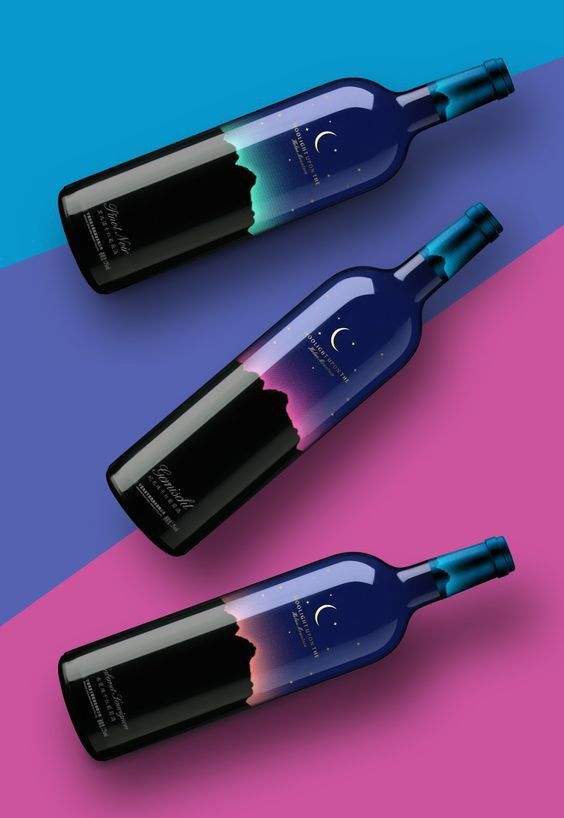
By Promotica May 6, 2025 The best red wine label design often balances elegance, uniqueness, and storytelling. Here’s a description of a highly compelling example:Name: Nocturne Reserve – Cabernet SauvignonDesign Style: Minimalist with a dramatic flair.Label Description:Background: Deep matte black paper with a soft, textured finish that evokes sophistication and mystery.Imagery: A single, stylized red crescent moon—foil-stamped in crimson metallic—glows at the top center, symbolizing night and depth.Typography:The name Nocturne Reserve is centered below the moon in a refined serif font, embossed in silver foil.Beneath it, “Cabernet Sauvignon – Napa Valley” appears in small caps using a contrasting sans-serif font, subtle and modern.Details: Vintage year and alcohol content discreetly aligned at the bottom corners in microtext, keeping the overall look clean.Texture: Spot UV gloss on the moon and text adds tactile contrast to the matte background.Shape: A tall, narrow label with rounded corners for a refined appearance.Order a professional wine label design from Promotica.pro Share How to properly draw a caricature Tips to create a professional and standout whiskey label design Post a Comment Cancel replyYour email address will not be published. Required fields are marked * Save my name, email, and website in this browser for the next time I comment. Post Comment Δ